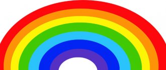
Color is one of the most powerful tools in a designer's toolkit. With its help you can attract attention, create a certain mood, influence emotions, perception and behavior.
Did you know that among the reasons that motivate customers to purchase a certain product, 90% are due to color? Or that color magazine ads are 26% more likely to be noticed than black and white ones?
The conclusion is clear: using the right color will help you achieve success. But a natural question immediately arises: how to choose the right color? To answer this, you will have to analyze several important aspects:
- color associations
- differences in color perception between men and women
- problems associated with color vision impairment.
Psychology of Color
Color not only helps to provide more objective information about a product, it can also have a powerful psychological effect. The same colors can act differently - in particular, it depends on the nationality and place of residence of the person. Let's dwell on color associations among people of the Western world.
Red color in psychology: danger, importance, passion
Red is the color of fire and blood. One of the most powerful colors in terms of impact, which is associated with both love and war. The well-known expression to see red (literally translated from English as “look at red”) means to become enraged, to lose one’s temper.
This color has a strong emotional impact. It may raise your blood pressure or increase your breathing rate.
Red color is energetic and impulsive. It is associated with speed and strength. This is why Netflix and YouTube use it as their dominant color.
The ability of red to attract attention is well known. In design it is often used as a powerful accent color. Similar to red carpets at awards shows, the color red can be used to highlight important details on a website page.
Orange color in psychology: confidence, energy, optimism
Orange is a very energetic color - like red, it excites, but to a lesser extent. It has an energetic aura, but without the aggressiveness inherent in red. Can create a joyful atmosphere.
On the home page of Hipmunk, a flight search engine, the orange search button immediately catches your attention.
Like red, orange has the ability to attract attention, so it can be used to highlight important details such as a call to action (CTA) button. Some people think this is too simple a solution, but many apps and websites often use this trick, which is “cheap” in a good way.
Yellow color in psychology: sun, happiness, attention
Oddly enough, yellow is associated with both joy and anxiety. It is often used to focus attention. An example would be warning signs. The color yellow can be associated with danger, but to a lesser extent than red.
Yellow color immediately attracts attention when contrasted with black. The Breitling watch brand used this property when developing its official website.
The combination of yellow and black works especially effectively. A striking example of this is the New York taxi.
Green color in psychology: nature, development, success
The color green is naturally associated with nature. It is associated with vitality and growth, as most plants on earth are green in color.
Green call to action button.
In design, this color is often used to create balance and harmony. However, to achieve balance, designers should consider color saturation.
Rich green shades attract attention due to their energetic, stimulating effect. This is why they are often used for call to action buttons.
Blue color in psychology: comfort, relaxation, trust
Blue is the color of the sea and sky. One of the most significant and frequently used colors in user interface design. At the same time, the visual perception of design developments will largely depend on the correct choice of shade:
- The light blue shade is associated with coolness, freedom and tranquility. Calmness can develop into trust, which is why this shade is often used in jars.
- Dark blue shades are great for projects where stability and reliability are very important.
The color blue is often associated with stability.
Purple color in psychology: luxury, spirituality, creativity
The natural color purple is rarely found in nature, so it has a special role in design.
Historically associated with royalty, the color purple is still associated with luxury today. It subtly hints at the high quality of the product or site (even if it is not).
Most young people consider purple to be the color of happiness.
Interestingly, 75% of children prefer purple to all other shades.
Black color in psychology: strength, grace, sophistication
Black is the most powerful of all colors. It immediately attracts attention, which is why it is most often used for texts and accents.
The black “Get started” button is one of the first things you see when you visit the Squarespace website.
When used as a dominant color - for example, to create a background - black can evoke original associations. With its help, it is easier to achieve a sense of sophistication and mystery in design.
White color in psychology: health, purity, chastity
The color white is often associated with purity, purity and virtue. By using white associations with health or the development of innovations, you can emphasize the safety of a promoted product from the field of medicine or high technology.
White areas create space around design elements, helping to highlight or separate them from each other.
In design, white perfectly sets off the colors adjacent to it, making it popular as a secondary color. Proper use of white margin is a powerful design tool. Consider, for example, the Google search page. White color gives more expressiveness to other shades.
Gray: formality, neutrality, professionalism
Gray is a symbol of neutrality. It matches easily with other colors. As a main background, gray creates a feeling of formality, which is not always a bad thing. Like white, gray background sets off other colors well.
Gray is usually paired with brighter color accents. On the Dropbox website, gray is used to highlight call-to-action buttons.
Gender and color
There are no definite norms yet regarding which colors are considered purely feminine and which are masculine. There are only the results of studies conducted over the past eight decades, which allow us to make some generalizations. And while the data is mixed, one conclusion is undeniable: men and women have different color preferences.
Most Favorite Colors
Least favorite colors
- Blue is the most popular color among both men and women. At the same time, men are much more likely than women to use variations on the theme of blue.
- The most unpopular colors among men and women are brown, orange and yellow. Gray is the least favorite color for women, while purple is the least favorite color for men.
- When it comes to shades and tones, men generally prefer bold colors, while women tend to choose softer shades.
- Most people think that pink is the color that all women adore, but this is not true. The number of his fans is a small percentage. Thus, although pink is associated with femininity in color psychology, it is not at all attractive to all women.
Yellow
Below is a set of logos of global brands, which are based on the color yellow. What can be said about it from the point of view of color psychology?
Positive characteristics that can arise under the influence of yellow: optimism, warmth, happiness, desire to be creative, increased mental abilities. Among the negative ones: irrationality, fear, frustration, cowardice.
- Yellow color is a symbol of youth, happiness, joy and sun.
- Lasting positive emotions can compensate for some psychological problems.
- Shades of yellow can appear dirty in certain lighting.
- Often has more impact when paired with a darker color.
Several personality characteristics regarding yellow: independence, determination, impulsiveness.
57% of men surveyed said that yellow was their favorite color, and only 1% said the opposite. 35% of women say yellow is their favorite color, and 0% have a negative opinion of it.
22% consider yellow a symbol of poverty.
Color in marketing and business
The role of color in creating a corporate identity
When developing a brand philosophy, color takes center stage among other factors. Every color we see directly or indirectly implies something, and this helps influence the perception of a particular brand. Some colors go beyond individual brands, symbolizing entire industries, for example, blue for the tourism business, green for healthy eating, red for fast food.
There are no clear rules for choosing colors when developing a corporate identity. Some use colors that are familiar to their industry, while others, on the contrary, prefer to go against tradition, believing that this helps to attract attention more effectively. For example, Virgin America decided to change the traditional concept when developing its website and application. And although this may not be exactly what users expect from an airline website, it nevertheless attracts attention.
There's not even a hint of blue in the Virgin America iOS app.
Thus, an unexpected color choice can be an effective technique to attract users' attention to your company.
Color and Conversion Rate Optimization
How can you use knowledge of color theory and psychology to encourage people to click? Choosing the color of your call to action (CTA) button is one of the oldest aspects of the conversion versus optimization debate. For every person who argues that red is the best color for a button because it attracts the most attention, there is someone who argues that green is the best color because it is associated with safety and encourages action.
HubSpot presented the results of its marketing research (A/B test), which shows how the choice of color for the call-to-action button affects the number of registered users.
A/B testing is the most effective and frequently used marketing research method.
Although it was initially expected that the green button would perform better, test results showed that the red button received 21% more clicks. At the same time, HubSpot warned its users that the test results were somewhat subjective - perhaps the audience preferred red because it was the only saturated color on the site page.
The color of a button in itself does not affect its absolute effectiveness - what works well on one site may be ineffective on another. The claim that one color converts better than another is false because there is no universal best color. However, there are still some rules based on practical experience that help you effectively use color to your advantage. One of them is the use of a psychological principle known as the “isolation effect.” According to this principle, people remember better an object that stands out from the rest “like an eyesore.”
For example, if your website or app has a lot of green in its design, users will likely not pay attention to the green button, even though A/B test data has proven its effectiveness at another company.
Evernote web service. Their “It's Free” CTA button is buried because it blends in with the background. It gets lost on the page and users don't notice it.
Sometimes you need to change the visual hierarchy of colors on a page to highlight your call to action button. Contrast plays a very important role - if the color of the button does not attract the attention of a potential client, then there will be no registrations/sales.
A call to action (CTA) button really attracts users' attention when it contrasts in color with the rest of the page elements.
Color and usability
Design involves not only beautiful design, but also functionality and usability - perhaps the two most important principles for the work of any UX designer.
Color is a tool that helps direct the eye to the desired objects. Choosing the right color when designing an interface not only attracts users, but also improves the efficiency of the user interface.
Limit the number of colors
When using different colors in your design, you should strive for balance. The more colors you use, the harder it is to achieve balance. Using too many colors is a common mistake developers make. They may be trying to influence users in this way and convey as much information as possible, but this can be very confusing for people visiting the site.
No matter what color shades you use, too many colors create an unfortunate visual effect.
Interior designers follow a simple rule of 60–30–10, which also works well when designing websites. This timeless technique will help you choose a balanced color scheme: 60% should be the dominant color, 30% the secondary color and 10% the accent color. This ratio guarantees color balance and a comfortable transition of the gaze from one object to another.
The formula 60% + 30% + 10% is the key to balancing the colors used.
Availability of color perception
People perceive colors differently. Approximately 8% of all men and 0.5% of all women suffer from color blindness to some degree. The combination of red and green suffers most from color vision impairment. The only way to avoid problems is to try not to use this color combination.
Many colorblind people have difficulty distinguishing red from green.
Let's take a common situation as an example. Have you ever received a message that a form was filled out incorrectly - something like “Fields marked in red are required”? While this is not a big problem for users with normal vision, people who are colorblind may find this message upsetting.
Website developers use only two colors to fill out forms: red and green. But colorblind people cannot distinguish between the fields highlighted by these colors.
As stated in the W3C guidelines, colors should not be used as the sole visual tool for the following purposes: conveying information, prompting action and response, or highlighting a visual element. Following these recommendations, site developers should pay attention to some points: the response message about errors should be more informative, for example, like this: “The email address you entered is not available”; or perhaps you should add an icon next to the fill field to attract the user's attention.
Additional visual cues and built-in error checking help highlight an incorrectly filled field.
Are there a few ways you can test your UI for accessibility?
- The WebAIM service will help you check color combinations.
- Using the Adobe Photoshop graphic editor will help you correct images using Color Universal Design. This will ensure accessibility of graphic information for people with color vision impairment, including color blindness.
Green
Below are a few green logos that are known to millions. According to color psychology, green is a symbol of health, freshness, nature, purity and growth. Negative psychological associations about green include boredom, lethargy, sacrifice, and weakness.
Here are a few points about green from a psychological point of view:
- the color relaxes the eyes and is a symbol of health;
- green has a clear association with freshness and a return to life;
- a very common color among eco-brands and pharmaceutical companies;
- This color is also loved by the business sector: banks, stock exchanges, finance and the military.
People who prefer green are, from a psychological point of view, open and friendly.
14% of men and the same number of women choose green as their favorite color. 2% of men do not like him and as many as 16% of women experience the same emotions. 6% of respondents consider the color “cheap”.
Pink
The best color in marketing, which can rightfully be considered one of the selling colors, is pink. This shade is used on almost all skincare products intended for women. Pink packaging attracts all girls, young and old. People associate this popular shade not only with creams and cosmetics, but also with glamor. If a marketer needs to show a woman's luxurious life, he will dress the young lady in a pink robe. Thanks to the bright shade, it will be easy to attract the attention of viewers and also gain their sympathy.
Even in advertising for men, marketers use a pink hue. To make products more attractive for the stronger half of humanity, they are advertised by girls who are dressed in bright miniskirts and pink tops.
Many people associate the pink hue with childhood and fairy tales. Cartoons for girls are designed in this shade. And also many of the toys that fill children's stores are made of pink fabric and plastic.
Orange: energy!
This color incorporates the activity of red and the cheerfulness of yellow. The result was a rich color, comparable in energy to a glass of vitamin-rich orange juice. Advertising of children's products and any products related to health, pharmaceuticals, sports, as well as the sphere of holiday services are friendly with the color orange, and rightly so. When exactly should orange be rejected? — When advertising elite and prestigious goods, orange shades will not provide the desired status effect.
Silver: nobility itself
If gold is respectable, then silver is aristocratic. He is restrained and laconic, like gray, but you can’t accuse him of being homely and boring due to his cold shine. The noble color of the metal, symbolizing reliability and strength, is loved in advertising of cars and equipment. He knows his own worth, but is always happy to be next to red, blue, and green.
Modern printing houses know how important it is for the client to get exactly this or that shade, because each of them is not an accident, but a conscious choice. It’s no secret that we ourselves are often under the impression when we print advertising materials. It's hard to take your eyes off the beautiful color combinations. And let’s add that we have everything to make advertising sparkle with the right colors.

Errors
There are endless ways to screw up a layout design. Finding such examples purposefully is a difficult undertaking, but we still managed to select a few for you. When you see them, you immediately realize that this is a terrible color combination.
The most obvious mistakes are:
- make a bright background;
- use graphic elements of the same tone as the background;
- use too contrasting shades: for example, red and blue.
Black
Black is another very versatile color. It can be modern or traditional, exciting or relaxing. But if you use black as a contrasting color, that is, in a ratio of 1:6, 1:8 to the main one, you risk introducing drama and sadness into the perception of visual advertising materials by your clients.
Here is an example of a landing page well thought out in terms of colors - what do you associate these colors with? — https://cashflow-igra.ru
Violet
Milka, Hallmark, Yahoo! and other famous brands, whose logos we see below, have chosen the color purple as the basis for their logo. According to color psychology, purple is associated with the following feelings: freedom, sophistication, fantasy, wealth. Negative emotions that violet can also cause are a decadent mood, dejection, depression.
Here are a few key points about the color purple that will be helpful if you're considering it for a marketing campaign:
- historically, the color purple is associated with superiority and wealth;
- suitable for brands that need to position themselves as prestigious brands;
- considered quite extravagant, so it should be used with caution;
- dark shades are calming and can be used for “feminine” brands.
Personalized characteristics of purple: sensuality, majesty, understanding.
1% of men chose purple as their favorite color, 23% of women had the same opinion. 22% of men and 8% of women considered him unloved. 4% considered it “cheap”.
Blue
Any professional who wants to succeed in sales should know the influence of color in marketing. What is the advantage of the blue tint? Blue is the color of peace and tranquility. Unlike rich blue, the whitened version seems more pleasant and attractive. The color blue often denotes toys for boys, recreational areas and beauty salons. The meaning of calm and tranquility is also suitable for places where a person comes to relax: a swimming pool, bathhouse or sauna.
In printed materials, blue shades are used in combination with black or white. Such combinations are considered catchy and classic. Blue is a low-impact shade, but it can attract attention and complement richer tones. In nuance, blue is rarely used. Few people want to create exclusively blue labels and business cards.
By studying the psychology of colors in marketing, a person understands that the less saturated the tone of a color, the more it appeals to a person. Therefore, you will not find a blue tint in a store as a banner. But you can find a lot of blue on food labels. It shows the client that the product is natural and contains some part of the sea. Most often, fish, seafood, seaweed and sea salt are packaged in such packaging.
What the Research Says
The perception of color depends on personal preferences, upbringing and cultural characteristics of a person, but when it comes to shopping and interaction with a brand, there are also universal points:
- for 80% of users, color affects brand recognition;
- 90% of customers decide to buy based only on the color of the product.
Color helps a brand stand out and be remembered from its competitors. It awakens memories and affects a person’s emotional state. And each in his own way. Let's figure out what email marketers can do about it.
White
When talking about the psychology of color in marketing and branding, it is impossible not to mention the white shade. It is one of the additional colors that is difficult to do without. What is the white advantage? The shade is associated with trust and purity of intentions. This color can be used by wedding salons, banks and numerous websites. Also, the white shade is associated with the hospital and with sterility. It is widely used in medicine and in advertising of hospitals and clinics.
Marketers like to present technical innovations to customers on a white background. This is done so that the clients' attention is focused on the technology, and not on the surrounding background. For this reason, most of the products in the online store are also presented to the viewer’s attention along with a white background.
White color is popular today, as graphics are in fashion. People prefer the classic combination of black and white over the rest of the color palette. Advertising made in the style of minimalism will attract the attention of customers no worse than a colored banner. And in contrast to other advertising posters, a monochrome banner will look ascetic and pleasant.
Green: harmony from nature
Green is nature itself, growing trees, blossoming leaves. We associate green with growth, health and life. Light and unobtrusive, it is interesting for its palette, where each shade has its own character. Take rich green and get an inviting effect and attract attention. Dilute the tone to mint or pistachio - you will get a calming shade for advertising face and body care cosmetics, medicines, healthy food and any other products of natural origin. Green in the minds of many people is the color of money, so it is chosen for the design of affiliate programs, banks, courses to improve wealth and everything related to money. By the way, have you ever wondered why the cloth for a billiard table in a casino is green? Psychologists have proven that he concentrates attention better than anyone else. Another point for green.
Blue
Below are a few brands that are based on the color blue. According to color psychology, blue is associated with the following feelings: trust, loyalty, logic, serenity, security. Negative associations include coldness, callousness, isolation, and unattractiveness.
- Blue color has a pronounced calming effect.
- It is the color of strength and freedom and is used by many brands.
- There are no natural blue foods in nature.
- Blue color is a symbol of calm.
Here are several personal qualities of people, according to psychologists, who choose blue: loyalty, sociality, politeness.
57% of men recognize blue as their favorite color, and 35% of women have the same opinion. Only 1% do not like this color and none of the women surveyed admitted this. The same number, 1%, consider blue to be “cheap.”