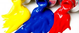
You and I have favorite colors. In general, color can be considered as an indicator of the characteristics of our personality. Our dominant color in clothing is what others pay attention to first. He can give away our secrets, or, on the contrary, broadcast our strengths, even before the other begins to get to know us.
In this article:
Why do you need the science of colors? The origin of burgundy color and its shades. Burgundy in clothes. The influence of burgundy on the psyche. Burgundy in the interior. Burgundy color in hair.
Why do you need color science?
Photo by Konstantin Mishchenko: Pexels
In general, studying the psychology of colors is not only interesting, but also useful. You can learn to read others like a book. Of course, not completely, but, as they say, a “summary” will definitely be available. Imagine, you came for an interview, or vice versa, you conduct the interview yourself.
Accents of clothing will give you an understanding of who is in front of you. And this, in turn, will help you draw the right conclusion or choose the right strategy. Each color, in fact, carries a multifaceted meaning. It is important to pay attention to a single color in order to reveal it to the maximum.
In this article you will get acquainted with burgundy. You will find out what it is and understand its semantic message from a psychological point of view.
White
White is the color of calm, purity and serenity. White color is characterized by perfection and completeness, demonstrating an absolute and final decision, complete freedom for possibilities and the removal of obstacles. Its fundamental quality is equality, because white contains all colors, they are equal in it. Its key meanings are: light, peace, chastity, concentration, virginity. Most often it is used as a background; all the colors on it look rich and bright. White was the color of social harmony and peace.
Possible negative associations: Too much white can lead to feelings of superiority or inferiority. It can be the color of detachment, coldness, indifference.
The origin of burgundy color and its shades
Let's start with the basics. The origin of this color dates back to 1891 from the word “Bordeaux”. Ten years later, it is transformed into the adjective “burgundy”. In Russian, until the beginning of the twentieth century, the expression “burgundy color” was used.
In turn, “Bordeaux color” meant “Bordeaux wine color”, as it got its name from the area in France - Bordeaux, where wine is produced. That’s why burgundy is also sometimes called wine.
Burgundy is not a primary color. It is obtained, in the classic version, by mixing red and blue. You can also get burgundy by mixing red and brown.
Shades of burgundy
- burgundy (with notes of purple, and unlike the classic one and is considered colder);
- oxblood (cool red-brown. Less bright and rich);
- Marsala (warm, not sharp);
- sangria (light wine, with a predominant rosé. Considered gentle and romantic);
- merlot (closest to brown);
- terracotta (included in the spectrum of warm and cozy colors), and others.
Getting acquainted with burgundy, it was not in vain that we paid attention to the shades. This will give the most correct idea of the meaning of this color in psychology.
Green
Green is the color of life and nature, symbolizing prosperity and new beginnings. It heals, relaxes and softens a person, so it is often used in the design of medical institutions, on the packaging of medicines, cosmetics and detergents. Green neutralizes the effects of other colors and helps dispel negative emotions. Brings calm and tranquility, helps to concentrate and make decisions. Has a strong association with spring, youth, renewal and naturalness.
Possible negative associations: In large quantities it causes excessive relaxation, turning into lethargy, boredom and laziness, so it should be combined with other colors. A color that doesn’t demand anything and doesn’t call anywhere (looks past everyone). It has many shades, which sometimes give completely opposite meanings. “Green” is what professionals call an untrained person, a beginner (meaning inexperienced, young). Green color is avoided on sweet packaging because... psychologists have proven that in people’s perception the color green is “bitter” or “sour”, but not sweet.
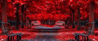
Burgundy in clothes
Let's start with the fact that in modern psychology, burgundy is a rather complex color. It is based on the color red. He “gives” burgundy willpower. At the same time, like brown, there is a tendency to deep thought.
Burgundy is associated with expensive wines and rubies. It belongs to elite flowers. It is chosen by women who know their worth. Burgundy is the color of business.
Psychology of color
It’s not for nothing that designers pay special attention to boron. In a business environment, it can easily replace classic black. Women involved in business at various business events prefer to appear in long dresses in wine shades. In this way, they convey to others their status, which implies belonging to high society.
Abuse of burgundy in clothing speaks of bloodthirstiness and mercilessness.
Characteristics of women who prefer burgundy
A little higher, you have already become acquainted with some characteristics. But what else can a burgundy dress say about a woman?
- She is a purposeful person. Solve problems faster than competitors do.
- Endowed with leadership skills.
- Confident.
- Combines assertiveness and restraint.
- Has organizational skills.
- Emotionally, she is stingy with emotions.
- Prefers stability.
- He is a conservative.
- He has refined taste and good manners.
- She is characterized by aristocracy.
Burgundy does not only apply to the business sphere. Creative women highlight it for themselves. They can be both philosophers and art connoisseurs.
Dark burgundy shades are preferred by women for whom self-sufficiency comes first. She will not sacrifice her own interests for the sake of public opinion.
Burgundy emphasizes the originality of nature and extravagance. A woman in burgundy will always attract the attention of the opposite sex. Burgundy emphasizes her self-confidence and status.
But don’t forget, overusing burgundy in clothes will have the opposite effect. Instead of being strong and strong-willed, or creative and romantic, a woman can be perceived as a bloodthirsty vamp lady.
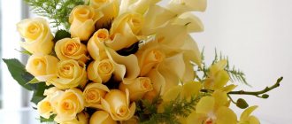
Yellow
Yellow is a bright, stimulating color that increases concentration, improves memory, organizes, and promotes quick decision making. Helps understand new ideas. Yellow is the color of the sun, energetic, but without aggression, the color of optimism, freedom, openness, mobility, sociability. Adjusts for communication skills. This color is openness and sociability. Helps to bring balance to emotions, find inner peace, and pacify emotional excitement.
People who prefer this color do not like fools, they like to be admired, they do not like to be driven into a corner. They are characterized by high self-esteem, self-confidence, and activity. The color yellow can “endow” an object with intelligence. This color will be successful in advertising high-tech products, goods for children, travel agencies, and advertising agencies. It is often used in food packaging, in particular bread, flour products, and cereals. Causes positive associations in advertising.
Possible negative associations: At the level of stereotypes, there is an opinion that Yellow is the color of separation. Yellow can also evoke associations associated with jealousy, envy, condemnation of others, “The Color of Gossip” (yellow press).
The influence of burgundy on the psyche
As you remember, burgundy is a complex and active color.
If there is too much burgundy, a person becomes:
- irritable;
- nervous;
- may become despondent.
The human psyche will perceive it as an automatic danger signal. This is due to the fact that on a subconscious level the color burgundy is associated with shed blood, which begins to thicken. And since blood loss is fraught with death, our brain perceives this as a danger and transmits this signal to our nerve cells.
To prevent such a reaction, it is important to dilute burgundy with other shades that will “put out” it.
Blue
Blue is the color of peace and universal harmony. This color is associated with intelligence and the ability to pacify with words. Associated with honesty, sincerity, purity, silence, coolness, but the strongest associations are the globe, water, sky, peace, ice. This is a comfortable color that evokes a feeling of well-being, security, and trust. The blue color is not as cold as blue, so being in the same range, it is more comfortable, the freshness and coolness of blue is completely different from the frostiness of blue. Perfume and cosmetics companies, as well as manufacturers of various hygiene products, actively take advantage of this psychological feature of color, using it on the packaging of their products.
People who prefer this color are friendly, they know how to listen, are not irritable, and wise. Blue color tunes in to the area of feelings, but more sublime, more platonic than mundane. Blue is the color of peace and universal harmony. It makes it possible to feel an invisible connection with the Universe, and is able to give the subject a holistic appearance, and the issue/case – globality and a favorable outcome. Toys and clothes intended for boys are traditionally blue.
Possible negative associations: Depending on the place of use, blue color may be considered not serious, sentimental. Sometimes it can be difficult to concentrate when looking at blue things; looking at a blue sky or looking at a blue object are two different things. Blue, like pink, is somewhat banal and stereotypical.
Burgundy in the interior
Dark shades of burgundy cannot be used in recreational areas, such as:
- bedroom, or children's room.
Because it causes tension in the nervous system.
It will be appropriate in rooms:
- bars;
- intended for parties and discos;
- various celebrations.
That is, in rooms intended for something dynamic and festive, where people can splash out a large amount of energy.
The restaurant hall, decorated in burgundy shades, will create a feeling of comfort and coziness.
The energy of burgundy color increases appetite and pushes people to take risks.
When decorating an apartment, burgundy should be approached with extreme caution, since in combination with other shades it manifests itself differently.
The most acceptable combinations of burgundy with other colors.
Since burgundy is a “warm” color, it interacts well with colors of the same spectrum:
- beige;
- cream;
- light grey.
Burgundy and black are considered a bold combination. However, in tandem these colors are not suitable for the living room and bedroom. Since their “interaction” presupposes rigor and businesslike notes.
Photo by Djim Loic on Unsplash
The combination of burgundy and brown is quite popular. And he speaks of the hostess not as a lover of luxury, but, on the contrary, indicates a certain modesty. But only if there are no “flashy” accents in the form of exclusive furniture and expensive decorative elements.
The combination of burgundy and dark green is recommended exclusively in those rooms where a person will not spend a lot of time, since such a “tandem” quickly gets boring and leads to increased fatigue. The best option for this combination is the bathroom.
But the combination of light burgundy with light shades will create an atmosphere of romance and love in the room.
Walls in dark burgundy shades are preferred by people declaring their high status. It was not for nothing that nobles in Tsarist Russia and noble people decorated their living rooms with fabrics and furniture in precisely these tones.
Bordeaux combined with gold is used for an elaborate classic. In expensive hotels you can often find such interior design.
Pink
The color pink symbolizes joy, youth, kindness, friendliness, and femininity. Like red, it is the color of love and flowers. It can also be said that pink is the color of dreams and hope; stereotypically it is often perceived as feminine. People who prefer pink are usually dreamy, conscientious, but more delicate; they try to avoid disputes and conflicts. Excellent for the sphere of personal relationships: enhances feelings, makes people more attentive, affectionate and sensitive. Pink is often used in cosmetics, especially for young girls, and is the color favored by toy manufacturers; often used in advertising perfumes, products for women and children, marriage agency services, and family centers. Toys and clothes intended for girls are traditionally pink.
Possible negative associations: Fragility, vagueness, weakness, frivolity. Perhaps frivolity (weakening the influence of red), putting yourself on display.
Оттенки Р±РѕСЂРґРѕРІРѕРіРѕ S†РІРµС‚Р° РІ онтерьере
РџРѕРєР° РЅРеРєРѕРјСѓ РЅРµ удалось РґРѕ РєРѕРхца разгадать тайРхСѓ загад RѕS‡РЅРѕРіРѕ Р±РѕСЂРґРѕ. Зато Сѓ дизайнеров получилось выделить несколько РѕС ‚тенков цвета. Р' таблице РІС‹ найдете основные варРеации.
| Название оттенка | Характеристика |
| Марсала | R“ранатовый оттеноRє SЃ SЏРІРЅС‹Рј RєРѕСЂРёС‡РЅРµРІС‹Рј RїРѕРґС‚РѕРЅРѕР ј |
| R'ургунди | Глубокий красно-бордовый |
| RљР°СЂРјРёРЅ | Насыщенный темно-красный СЃ коричневыми Рхотамми |
| Мерло | РўРѕРЅ, максРемально R±Р»РёР·РєРёР№ Рє RєРѕСЂРёС‡РЅРµРІРѕРјСѓ |
| Р'урый | Приглушенный оттенок СЃ преобладанием RєРѕСЂРёС‡РЅРµРІРѕРіР * |
| Сангрия | Ярко-бордовый с выраженными красными нотамми |
| Кардинал | Оттенок СЃ лидирующими SЏSЂРєРѕ-красными тонами |
| RўРµСЂСЂР°РєРѕС‚Р° | RњСЏРіРєРёР№ тон СЃ выраженной рыжинкой |
Однако РЅР° выборе оттенка дело РЅРµ R·Р°РєР°РЅС‡РёРІР°РµС‚СЃСЏ. Следующий этап РЅР° пути Rє SЃРѕР·РґР°РЅРёСЋ SЃС‚ильного дизайн-РїS ЂРѕРµРєС‚Р° — рассмотрение вариа S†РёР№ РёР· спектра SЃРІРµС‚лых Рё темных тонов.
RЎРѕРІРµС‚! РќРµ стоит сочетать РІ интерьере RѕРґРЅРѕР№ комнаты боле Рµ РґРІСѓС… оттенков цвета. Р'ажно, чтобы тона соотносились RјРµР¶РґСѓ СЃРѕР±РѕР№, создава R»Рё РёРіСЂСГ, дополняли РґСЂСѓРі РґСЂСѓРіР°.
Brown
Brown is the color of strength, solidity, stability, practicality. Brown symbols: soil, tree, earth, autumn. It has abstract symbols - hard work, endurance, conservatism. Brown, along with black and navy blue, often dominates the clothing of rich and confident people, which emphasizes their sense of self-worth. Brown is the color of coffee and aromatic spices; it is exquisitely used in the interior design of coffee shops and restaurants. People who prefer this color desire physical relaxation, peace, and concentration, so it can be used in office themes.
Possible negative associations: Brown color may seem boring, even depressing, and may cause associations with tobacco, smoking, and unpleasant odors.
Grey
Gray color connects white and black, forming a harmony of two opposite colors. Neutral in itself, it has a subtle beauty, especially when combined with bright colors. Gray is the color of intelligence, it relaxes and helps you feel calm. It is universal and conservative, can be used in almost any field of activity to create brevity and sophistication.
Possible negative associations: Gray can be associated with bad weather, illness, feelings of uselessness, melancholy, and fatigue. His capacity for peace may be replaced by a feeling of endless melancholy and sadness. It is rarely used when creating packaging for detergents, shampoos, and hygiene products, because... in the psychological perception of people, gray is the color of the city, modern offices, asphalt, dust, but not shampoos.
Vital activity
A representative of the stronger sex who prefers dark red shades is not uncommon today. Long gone are the days when men tended to choose dark colors. Now everyone is free to act according to their individual taste. As a rule, extraordinary individuals tend to dress brightly and look for additional perspectives that would allow them to more fully express their personal qualities. Life activity forces a person to move a lot, to feel the need to try to build life according to his own scenario, and not to adapt to those around him. Such an individual is not afraid to experiment and often makes completely rash decisions. If at some point something goes wrong, he can admit the mistake, although such a decision is not easy for anyone.